You know you’re getting close to the premiere of Big Brother 16 when CBS releases its new logo design for the upcoming season.
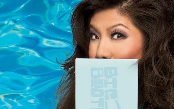
Just spotted in the wild, well the wild of social media, the new Big Brother logo features a freestyle, silly text style similar to what we saw last year. Not that this is a bad thing, unless you demand discipline and rigid, straight lines in your logos!
The new BB16 logo from CBS will likely be featured in commercials and the CBS website soon as it has already on their official Twitter account.
What do you think of the new design? Does it help get you excited for the new season as a lead in to what’s to come? Don’t forget to join us on Facebook, Twitter, and by Email to get the latest Big Brother 16 updates, spoilers, and news all season!
Open casting has ended and finalists are being selected as we head toward the June 25, 2014 season premiere. Are you ready?!
If you look at the logo from a distance, the “G” kinda looks like a “C”
Maybe BBUS is following BBCAN’s lead and getting major in-show sponsorships. This year Bic lighters is the official sponsor of “Bic Brother!”. The twist will be all the HGs are smokers and the prize is a half-million lighters.
Nothing will beat Twistos. Don’t even try BBUS.
Is this for the show’s promotional outings or for the show itself?
Regardless, it’s looking like they’re finally going to shed off the “Real World-esque” feel of the original BB2 logo.
Probably just the promotional content. I’d expect us to see the usual “Big Brother” plain text logo at the intro video each week. They do these sorts of designs for the commercials each preseason.
love to see regan again in that house
Hello Fellow BB Viewers,
I will compose this respectfully and delicately as possible with NO INTENTIONS to offend anyone. I sincerely hope that CBS has selected House Guests who represent a more equitable part of society across racial,ethnic and sexual orientation lines.For too many years,the make up of the HGuests have been lopsided with the majority of one race and the “token” inclusion of one or two others from another race and a “sprinkle” of one with a different sexual orientation. It can almost predicted each year what the guests make up will include. I will not insult your intelligence by pointing it out. All I am stating is IF CBS was REALLY interested,a more concerted effort could be made to balance the situation which would/could add to the dynamics.
HAPPY VIEWING!
But isn’t that unfair to the people who applied made it to the finals and couldn’t get in because they were of the majority race. Contestants should be able to go into the house based on their own merit, not whether o not they’re black or white. Casting picks the people that fit the most interesting group and it’s only natural that there are more white people than the minorities, the casting on these shows is a reflection of America’s actual population.